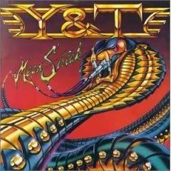
Kinda got an Asia thing going on, it's just ok
For that time in the 80s, hell yeah
Just OK. A bit amateurish--they could have spent a few more bucks on a better artist and made it much better.-- david
Well it's definitely 80's Metal "Hell Yeah!" Some of them were pretty cheesy looking though."Ok" for me on this particular design.
I like the band logo, but the picture is a little too busy and a little dated. Just alright I would say.
This comment has been removed by the author.
The picture is fine! The font I'm not so sure. Not having heard of Y & T before, I was seeing "Y8TE" and reading it as Yatey. The "mean streak" just looks like snot.
Something about this cover reminds me of a Judas Priest cover from Screaming for Vengeance. Maybe it is the bright color scheme.Back in the day when this disc was released, albums were still around. You wanted a cover to pop, and that one would certainly grab your attention. By today's standards, it is kind of cheesy, but I still like it. :)
Catches ones eye but it does look too busy...
I like it, metal snake....whoohoo
For the time period, I think it is a decent cover. I really like the colors, but agree with David and it is a little amateurish.
It's not bad. I like the band logo too, but the snake is dated and kinda cliche.
the general idea was good. definitely looks early 80s, but it was the early 80s, so yeah - i like it.
I like the cover and the logo. It was '83 so every band had to have a distinct logo. I like the snake better than the Black Tiger cover from '82. I agree that it looks a bit Priest-ish in a Screaming For Vengeance/Defenders of the Faith way but more shiny.
Kinda got an Asia thing going on, it's just ok
ReplyDeleteFor that time in the 80s, hell yeah
ReplyDeleteJust OK. A bit amateurish--they could have spent a few more bucks on a better artist and made it much better.
ReplyDelete-- david
Well it's definitely 80's Metal "Hell Yeah!" Some of them were pretty cheesy looking though.
ReplyDelete"Ok" for me on this particular design.
I like the band logo, but the picture is a little too busy and a little dated. Just alright I would say.
ReplyDeleteThis comment has been removed by the author.
ReplyDeleteThe picture is fine! The font I'm not so sure. Not having heard of Y & T before, I was seeing "Y8TE" and reading it as Yatey. The "mean streak" just looks like snot.
ReplyDeleteSomething about this cover reminds me of a Judas Priest cover from Screaming for Vengeance. Maybe it is the bright color scheme.
ReplyDeleteBack in the day when this disc was released, albums were still around. You wanted a cover to pop, and that one would certainly grab your attention.
By today's standards, it is kind of cheesy, but I still like it. :)
Catches ones eye but it does look too busy...
ReplyDeleteI like it, metal snake....whoohoo
ReplyDeleteFor the time period, I think it is a decent cover. I really like the colors, but agree with David and it is a little amateurish.
ReplyDeleteIt's not bad. I like the band logo too, but the snake is dated and kinda cliche.
ReplyDeletethe general idea was good. definitely looks early 80s, but it was the early 80s, so yeah - i like it.
ReplyDeleteI like the cover and the logo. It was '83 so every band had to have a distinct logo. I like the snake better than the Black Tiger cover from '82.
ReplyDeleteI agree that it looks a bit Priest-ish in a Screaming For Vengeance/Defenders of the Faith way but more shiny.