Judge the album cover
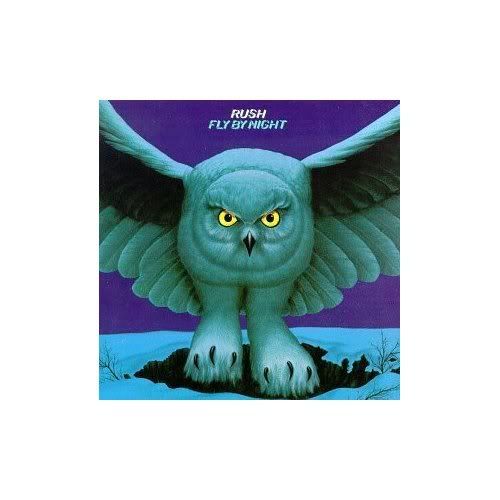
It's a special judge the album cover this week. Special because because this week is "1970's week" so both covers are from that decade and special because there are two covers to judge this week. So here is cover A which is Bandolier by Budgie. Here is cover B which is Fly by night by Rush
 So what do you think of each one?


Being a Canadian and a fan of old school hard rock/ heavy metal, it's probably doubly blasphemous to say this but... Rush is one of the FEW bands I just can't tolerate at all. However, I'll give them credit here. Their owl certainly kicks Budgie's ass. The owl is simple and menacing at the same time, the Budgie album looks like the cover of a fantasy book you'd find in a bargain bin at a used book store. The only good thing about the Budgie cover is their logo- looks like a cross between Arabic and bong smoke. Cool.
ReplyDeleteNeither one of these are the 'greatest' in my opinion, but I have to cut them some slack in lieu of the era... Out of the two I guess I like Budgie's best, even though the 'budgie heads' don't seem to fit--I still like the surrealistic overtones of the entire piece.
ReplyDeleteThe detail on the Fly By Night album is 'ok', but I think both could've had better art work done for their albums.
I vote for Budgie, as that cover captures the cool-yet-loopy vibe that was their bread and butter. I mean, listen to the stomping masterpiece that is "Napoleon Bona-Part 1 & 2" and try not to envision majestic warrior budgies on horseback...it can't be done.
ReplyDeleteRegarding Fly By Night, the owl doesn't really represent anything from the album. The title track is a simple rumination on upping stakes and leaving home, with nary an owl reference to be had. To me, this cover misses an opportunity to depict "By-Tor and the Snow Dog" visually--now that would be an album cover.
Any album cover that allows me to say the words, "Yes, I would like the record with the musclebound parrot warlords on horseback..." is an automatic winner to me.
ReplyDeleteBeing a Planet of the apes fan, I like Budgie cover because it's a play on that. I like the colors and the background too. The logo should have bigger and more distinct though. I like the Rush cover, but not as much. I like the background a bit, but the owl might be a little too simple.
ReplyDeleteI like both, for some of the reason already stated here.
ReplyDeleteRush's cover is good for another reason--unlike many covers, it is still distinctive at a great distance (or in a very small version).
-- david
The budgie cover is kind of cheesy but I like it for some reason. It has that low budge 70s album cover look to it.
ReplyDeleteThe Rush cover is cool. Rush has always had good album covers and packaging. My favorite would have to be A Farewell to Kings or Moving Pictures. Signals was probably the worst cover although the music inside is good.
Btw...I'm really getting stoked for the new Rush CD. They have a 15 second sample up at their site and it sounds promising. That's how excited I am that 15 seconds of music can do it for me.
ReplyDeleteyes, I see, planet of the apes. "get your stinkin claws off of me you damned, dirty parrot!"
ReplyDeleteI like the first one better. The owl - I just don't get it, especially the feet.
birds of a feather, I see... Budgie's Planet of the Parrots cover appeals to me as a lover of surreal art, and Fly By Night is simplistic yet detailed and sort of indicative of a lot of rock album covers of the 70s. Budgie gets the edge for its originality
ReplyDeleteI like B, A is just horrible :)
ReplyDeleteI like the Fly By Night album cover better. I was never a real big fan of Planet of the Apes. I also happen to like Rush so I'm a little biased here.
ReplyDeleteRush's cover beats the hell out of Budgie.
ReplyDeleteMan, I love those Budgie covers! First of all, they buck the emrging metal trend and name themselves after a decidedly non-threatening little bird,and then they go ahead and use that little bird as a mascot in a heroic and utterly inappropriate way that totally makes me grin. As another commentator points out, it captures their musical vibe too. Budgie are so cool. Gotta get the new album!
ReplyDeleteThe Rush cover is okay, I guess...it's distinctive and memorable. Just doesn't make me grin! But I suppose that's fair enough - Rush have never been a humorous band, anyway.
I really loved the Rush cover and was actually the first album I have bought of Rush. Way cool in those days.
ReplyDeleteI like the Budgie cover. I feel it makes a statement, It might be a fantasy/sc-fi statement that's cheesy, but a statement all the same. The painting/drawing is in a style I like too. Blends well together.
ReplyDeleteRush's is nice too. I like the paws on the owl and having it stare right at you is a little unsettling. I still like Budgie better.
Ever since I made this post I have been listeing to just these two bands.
ReplyDeleteI like the Rush Cover, but that Budgie cover is just too strange.
ReplyDelete