Horror and fantasy have often appeared on metal album covers. Here is the cover of Cirith Ungol's 1984 release "King of the dead". So do you like it, not like it or think that it's just okay?
The artwork is stellar. The imagery is overdone, even by early-80s standards.
The crime here is that if you aren't a fan of the band, and you pick this up, there's a good chance you can't see the band logo. Why bury the band and highlight an oil painting?
Hi Mark, long time reader, first time poster here. First, I'd like to congratulate you for the great site. I'm addicted to it! Now, about the cover, I think it's amazing! I was really into the sword-and-sorcery themes in the 80s (when I was a teenager), I used to love the Conan movies and comics, and Manowar at that time was a religion to me. So you can imagine my reaction when I first saw that cover... it reminded me of some Frank Frazetta artworks... I just loved it - much, much more than the music in that album itself...
I love that cover. Is that a Frank Frazetta painting? Frazetta did a lot of Conan art. I went to his gallery in PA. a few years back. It was awesome seeing those paintings in person.
Mark - I would love to read a review of this album. I've heard a song or two by this band and have often wondered if they are any good. Some people seem to really like them. Maybe you can give us a quicky review some day.
The only album I have heard by these guys is One foot in hell and that was a long time ago. I should probably pick up some of their stuff soon. Here is the link for an interview with their drummer. He does talk some about the cover art. http://www.sleazegrinder.com/int_CirithUngol.htm
The cover was from a Michale Moorcock book from DAW, one of the Elric series...GREAT books by the way... I had this poster on my wall back in the day, from the book, not the band, so I dig on the cover!!!!
That's the very beauty of it. How many album covers (if they're still making albuns in these times of MP3...) today would fire the imagination of a 12 year old kid like this? No one, unfortunately...
A band that dropped off the radar long before they could've peaked. They're from Ventura, California, and still have some connections to L.A's reappearing thrash scene.
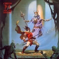
The artwork is stellar. The imagery is overdone, even by early-80s standards.
ReplyDeleteThe crime here is that if you aren't a fan of the band, and you pick this up, there's a good chance you can't see the band logo. Why bury the band and highlight an oil painting?
I love it. Like a cross between a Carvaggio painting and old He-Man cartoons with a dash of evil.
ReplyDeleteHi Mark, long time reader, first time poster here. First, I'd like to congratulate you for the great site. I'm addicted to it!
ReplyDeleteNow, about the cover, I think it's amazing! I was really into the sword-and-sorcery themes in the 80s (when I was a teenager), I used to love the Conan movies and comics, and Manowar at that time was a religion to me. So you can imagine my reaction when I first saw that cover... it reminded me of some Frank Frazetta artworks... I just loved it - much, much more than the music in that album itself...
I love that cover. Is that a Frank Frazetta painting? Frazetta did a lot of Conan art. I went to his gallery in PA. a few years back. It was awesome seeing those paintings in person.
ReplyDeleteI don't really care for that album cover. Nothing really stands out to me on it.
ReplyDeleteTheir band logo needs to stand out more.
Mark - I would love to read a review of this album. I've heard a song or two by this band and have often wondered if they are any good. Some people seem to really like them. Maybe you can give us a quicky review some day.
ReplyDeleteThe only album I have heard by these guys is One foot in hell and that was a long time ago. I should probably pick up some of their stuff soon. Here is the link for an interview with their drummer. He does talk some about the cover art.
ReplyDeletehttp://www.sleazegrinder.com/int_CirithUngol.htm
+++. It's like a good fantasy novel cover.
ReplyDelete-- david
I think the art work is really cool, neat layout and all... I Like It.
ReplyDeleteeveryone else sums up my opinion, and we used to swap Conan books back and forth, so of course this meets my approval!
ReplyDeleteDungeons and Dragons ? Of course I like it...
ReplyDeleteI like the cover a lot except I agree the band logo should have been more easier to see.
ReplyDeleteThe cover was from a Michale Moorcock book from DAW, one of the Elric series...GREAT books by the way...
ReplyDeleteI had this poster on my wall back in the day, from the book, not the band, so I dig on the cover!!!!
I love anything with sculls, I have seen this cover before.
ReplyDeleteI am always in awe of the detail:)
I love that cover art! Very cool!
ReplyDeleteBack in the '80s I would've thought it was cool, but it's kind of dated and cheesy now, no?
ReplyDeleteI Love It! That's it. I'm a sucker for these fantasy covers.
ReplyDeleteHey beckeye...
ReplyDeleteThat's the very beauty of it. How many album covers (if they're still making albuns in these times of MP3...) today would fire the imagination of a 12 year old kid like this? No one, unfortunately...
A band that dropped off the radar long before they could've peaked. They're from Ventura, California, and still have some connections to L.A's reappearing thrash scene.
ReplyDelete