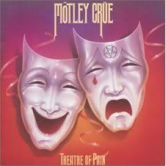
Motley Crue's Theatre of pain was probably the most anticipated hard rock release of 1985. I remember waiting for it to come out and then being a bit surprised by the cover. Much like their costumes for this tour and their sound, this cover was very different from the previous two Crue albums.
***So do you like the cover, don't like it or is it just alright?
I've always liked the album cover, just thought they could have made it better.
ReplyDeleteIt looks cheap, not like they're ready to have their big break through. It might not have seemed as bad as the music at the time, but today it looks dated and clichéd.
ReplyDeleteIt's okay, a little too bright with the colors. A big clash with the Shout at the devil image.
ReplyDeleteI like the play on the comedy and tragedy theatrical symbols. But I think they could have done more with it.
ReplyDeleteKind of lame. I'm surprised that they didn't remove the pentagram from this one like they did to the original Shout at the Devil.
ReplyDeletesad to say, it's more original than the Shout at the Devil cover, though we all know which is the better album
ReplyDeleteit was a cool cover & the pastels highlighted the light more glam look the band went to for this album & tour
ReplyDeleteI've seen better theater mask prison tats. It's a little cheesy for my tastes.
ReplyDelete