Midnight Chaser-Rough and tough
Don't judge an album by it's cover because the music here is pretty good.However the album cover is an eyesore. A brightly colored, silly eyesore that looks like it was drawn by a high schooler and colored by someone wearing a blindfold.
2-

Sebastian Bach-Kicking and screaming.
This is an odd and very messy cover. I am not sure what they were aiming for, but the end result is sloppy.
3-

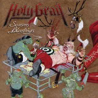
Holy Grail-Seasons Bleedings
Messing with Santa is never cool.
4-

Chickenfoot-3
Sometimes a band can just put a logo on a cover and it works. Van Halen II and Twisted Sister's You can't stop rock and roll are examples of good covers with just a logo. However in order for that to work you first have to have a good logo. That's the main reason why this cover fails. Dull logo=dull cover.
5-

Arch/Matheos-Sypathetic Resonance
It's hard to have something on fire on a cover and still be boring yet this one manages to do just that. Maybe it's the generic logo or the plain blackground or the fact the flames look subdued, but this whole cover is very unspectacular.
Is that the guy form the VVI video on the cover of #5?
ReplyDelete