Judge the album cover
Okay, here is the debut of a new segment. It's simple, I show an album cover and you say if you like it, don't like it or think it's just okay. If you want to say why you feel the way you do then that would be great as well.
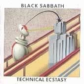 So the album cover we are judging here is Black Sabbath's 1976 release Technical Ecstacy. A very different album cover for this band and that's why I picked it. So what do you think of the cover?
not quite what one would've expected from them, but I think it is kind of in the vein of Pink Floyd's internal art for "Wish You Were Here." I also think a lot of art of the 80s took cue out of this. For some reason, J. Geils Band's Freeze Frame cover is coming to mind, though it's not the same thing.
ReplyDeleteHorrible, horrible, horrible. After some classics like the debut album and Sabotage, this was a monstrous indicator of the general decline of the music within.
ReplyDelete-- david
I like it.
ReplyDeleteIt has a clarity and a simplicity that you rarely see in heavy metal album covers.
I'm a fan of Hipgnosis's work in general, so I like it. It's cryptic and ambiguous, and doesn't scream "metal!" at you in a way a cover like "Born Again" did...a good thing in my books; maybe not so good in someone else's view.
ReplyDeleteI like it overall. Not great, but decent. I think the angles and the white boarder help it a lot. I like that it's a bit more subtle.
ReplyDeleteIt's a little "Mr. Roboto" for my taste.
ReplyDeleteWhen I first saw this album cover I thought I'd first listen to it than just buy it. It was very outlandish for metal albums at that stage to have such a pop cover. The music on the album reflected the confusion of the cover and it was obviously a major period of hardship for Sabbath with Ozzy breaking away. Especially noticable on the sudden ending on "Back Street Kids". But I must say over the years it grew one me, and was one of the first remasters I bought again. Back on the album cover though - I think it is distinct and seemed to me to symbolize sex. Something different, but horrible I don't know...
ReplyDeleteIt is like what they where trying to say was not presented strong enough.....dont like it much!
ReplyDeleteit's a good cover in terms of design and style. so, out of context, i like it.
ReplyDeletebeing a black sabbath cover, though, makes it a no-no for me. that's not at all the mood i want from black sabbath....
I'm not real crazy about it. They could have done a better job with the robot.
ReplyDeleteStrange, for sure. Are they on escalators? If so, would that mean the Iron Man is going down? Self-imposed prophecy, maybe?
ReplyDeleteI generally enjoy older album covers simply because most of them were hand painted (the original design that is...), but this one is totally lost on me. I don't understand the connection between the album name and the image. Even if it made sense, the picture in general sucks. It looks like a big phallic robot riding an escalator with a building in the middle...
ReplyDeleteI give it a 2.
That would have been a good cover for Duran Duran or Flock of Seagulls...but Sabbath?
ReplyDeleteI don't care for it much myself. It kinda fits the album title, but I wouldn't necessarily associate Black Sabbath with it, and I might not even bother with it. It says we've moved into a different direction, even if they haven't.
ReplyDeleteWeird....it looks more like a cover for Jefferson Starship or something.
ReplyDeletePretty good feedback for this topic. I think that I may start doing this segment once a week. I will post it on Sunday and then not post on Monday.
ReplyDeleteThanks a lot for what You are doing!Information, that I managed to find here
ReplyDeleteis extremely useful and essential for me!With the best regards!
David
Man that is an odd cover from a beast of a Heavy Metal Machine that Black Sabbath is. Good Grief that is hideous!
ReplyDeleteIt's ok, but it looks more like a Pink Floyd cover than Sabbath.
ReplyDeleteThanks a lot for this place, where people can leave their ideas and opinions, it's great!With the best regards!
ReplyDelete