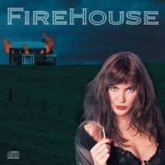
The offering for this week is the cover of Firehouse's 1990 debut. So do you like it, hate it or just think that it's okay? Feel free to explain you picked the choice that you did.
Bad band, kinda lame cover. Cliche for its time with the pyro woman holding a match to a lit house, I don't know. It's indicative of what was happening with metal album cover art...kind of like Great White's "Once Bitten" album, though that model was a lot cuter than this one. I think it's just another example of trying to use women to sell convoluted party rock.
Lame concept. Poorly composed cover, too. I'd assume this was a cover hastily thrown together by one of the band members, not anyone with any design experence, reckon that the concept reflected the creativity to be found in their musc and avoid it.
As I recall, I'd be quite right- Firehouse were really unexceptional hard rock with a painfuly large share of ballads. Pah.
The thing I remember most is that when they came out I dismissed them saying that Gene should sue them for using a KISS song title for a band name. LOL!
What killed this band was 'Love Of A Lifetime'.....overplayed to death.
Cheesy. She's too prominent in the forefront. A very dated cover. Mind You, the lady does bear a resemblance to Shannon Tweed (with brown hair) and Gene should sue for that.
Sounds like it's split as to if it's sexist or sexy. Anyway, I have done one 1970's cover and now one from the 1990's. So for the next few weeks I will go straight into the prime of metal and pull out som covers from the 1980's. Next one coming up on Super Bowl Sunday.
Bad band, kinda lame cover. Cliche for its time with the pyro woman holding a match to a lit house, I don't know. It's indicative of what was happening with metal album cover art...kind of like Great White's "Once Bitten" album, though that model was a lot cuter than this one. I think it's just another example of trying to use women to sell convoluted party rock.
ReplyDeleteDon't like it!!they should have blended her in more with the surroundings....and thats not even nice underwear...hihihi...;)
ReplyDeleteThat band (and cover) always makes me laugh. I don't know why...maybe its the cheese factor (which I love)..but some of those songs are just corny.
ReplyDeleteLame concept. Poorly composed cover, too. I'd assume this was a cover hastily thrown together by one of the band members, not anyone with any design experence, reckon that the concept reflected the creativity to be found in their musc and avoid it.
ReplyDeleteAs I recall, I'd be quite right- Firehouse were really unexceptional hard rock with a painfuly large share of ballads. Pah.
The thing I remember most is that when they came out I dismissed them saying that Gene should sue them for using a KISS song title for a band name. LOL!
ReplyDeleteWhat killed this band was 'Love Of A Lifetime'.....overplayed to death.
The cover is OK, not great.
She looks more like she should have a lollipop in her hand... then I'd make a good cover for Warrant.
ReplyDeletetoo bad for words. terrible (and rather sexist) concept, atrocious design, it's not even bad in a kitsch way.
ReplyDeleteew. :)
The thing I remember about this album was that the house looks a lot like a place near where I live. Even the hill that it's on.
ReplyDeleteI also think that the woman has a scary expression on her face. I like the Firehouse logo a lot.
ReplyDeleteSuch a cliche cover...nice girl though.
ReplyDeleteSilly cover, hot girl! I guess there is a balance. LOL! :)
ReplyDeleteCheesy. She's too prominent in the forefront. A very dated cover. Mind You, the lady does bear a resemblance to Shannon Tweed (with brown hair) and Gene should sue for that.
ReplyDeleteI never got past her chest to examine the rest of the album!
ReplyDeleteIt worked for me. I am a sucker for cleavage though.
ReplyDeleteSounds like it's split as to if it's sexist or sexy. Anyway, I have done one 1970's cover and now one from the 1990's. So for the next few weeks I will go straight into the prime of metal and pull out som covers from the 1980's. Next one coming up on Super Bowl Sunday.
ReplyDeleteIt's so bad it's almost good. And the first couple of tracks were light years better than "Love of a Lifetime."
ReplyDeleteThat doesn't mean they were good, of course.
-- david
I like the girl. You know she's not saying "Baby, don't treat me bad".
ReplyDeleteFitting for the album.
ReplyDelete