Thursday, February 07, 2008
If you are a band or a label or a publicist and you'd like me to check
out what you're doing, review your music or interview you, contact me
HERE.
Fan Mail
Whole post and comments here
“go FUCK YOURSELVES and take your FUCKING NINETIES CRAP and SHOVE IT UP YOUR ASS!!! And you DEATH METAL MORONS SUCK $%#^%#^!!!!
”-anonymous
Whole post and comments here
"this is the worst review i've ever read"-Jake Dean
Whole post and comments here
this is the worst review i've ever read
“You need to go to a hearing specialist because you obviously cant hear anything in those 2 holes."-anonymous
Whole post and comments here
“Your a fucking retard. these guys are immensely talented. you probably like metallica or some stupid band like that.”
-anonymous
Whole post and comments here
"you obviously don't know what you are talking about.”
-anonymous
Whole post and comments here
"No reason to rag on D&D just because you have the imagination of a fucking peanut, sir."-anonymous
Whole post and comments here
"It does surprise me that, with the narrow focus of your musical interests, you can't sort out what's good and what's bad in this case.”
-Bob Vinyl
Whole post and comments here
"So, in closing, fuck you METAL MARK. Fuck you, fuck Lynch Mob, and fuck your shitty website!”
“I don't know who this METAL MARK is, but I know better than to waste my time checking out anything else written by this asshole”
-Mike
Whole post and comments here

Contributors
"you need to just stop acting like douchebags and get a fucking life."
“You are insignificant and do not support 80s metal so go fuck yourselves and stop pretending to be 'metal'.”
-Sam
- Whole post and comments here
“I do not agree with basically everything you say and will not be coming back to your site again.”
-anonymous
-
"you need to just stop acting like douchebags and get a fucking life."
“You are insignificant and do not support 80s metal so go fuck yourselves and stop pretending to be 'metal'.”
-Sam
- Whole post and comments here


Previous Posts
- Naked Beggars-XXX
- Check out Keep the victim warm
- Interview with Paul Arnold of At War
- Biloxi-3 In the wake of the storm
- Sister Sin-Smash the silence
- Interview with Bob Mitchell of Attacker
- What's coming up?
- Super Bowl story
- Lesser of two evils
- Led Zeppelin Crashed Here by Chris Epting
Archives
- June 2005
- July 2005
- August 2005
- September 2005
- October 2005
- November 2005
- December 2005
- January 2006
- February 2006
- March 2006
- April 2006
- May 2006
- June 2006
- July 2006
- August 2006
- September 2006
- October 2006
- November 2006
- December 2006
- January 2007
- February 2007
- March 2007
- April 2007
- May 2007
- June 2007
- July 2007
- August 2007
- September 2007
- October 2007
- November 2007
- December 2007
- January 2008
- February 2008
- March 2008
- April 2008
- May 2008
- June 2008
- July 2008
- August 2008
- September 2008
- October 2008
- November 2008
- December 2008
- January 2009
- February 2009
- March 2009
- April 2009
- May 2009
- June 2009
- July 2009
- August 2009
- September 2009
- October 2009
- November 2009
- December 2009
- January 2010
- February 2010
- March 2010
- April 2010
- May 2010
- June 2010
- July 2010
- August 2010
- September 2010
- October 2010
- November 2010
- December 2010
- January 2011
- February 2011
- March 2011
- April 2011
- May 2011
- June 2011
- July 2011
- August 2011
- September 2011
- October 2011
- November 2011
- December 2011
- January 2012
- February 2012
- March 2012
- April 2012
- May 2012
- June 2012
- July 2012
- August 2012
- September 2012
- October 2012
- November 2012
- December 2012
- January 2013
- February 2013
- March 2013
- April 2013
- May 2013
- June 2013
- July 2013
- August 2013
- September 2013
- October 2013
- November 2013
- December 2013
- January 2014
- February 2014
- March 2014
- April 2014
- May 2014
- June 2014
- July 2014
- August 2014
- September 2014
- October 2014
- November 2014
- December 2014
- January 2015
- February 2015
- March 2015
- April 2015
- May 2015
- June 2015
- July 2015
- August 2015
- September 2015
- October 2015
- November 2015
- December 2015
- January 2016
- February 2016
- March 2016
- April 2016
- May 2016
- June 2016
- July 2016
- August 2016
- September 2016
- October 2016
- November 2016
- December 2016
- January 2017
- February 2017
- March 2017
- April 2017
- May 2017
- September 2017
- October 2017
- November 2017
- December 2017
- January 2018
- February 2018
- March 2018
- April 2018
- May 2018
- June 2018
- December 2018
- April 2019
- March 2021


















Subscribe to
Posts [Atom]
View mobile version



7 Comments:
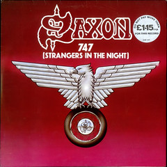
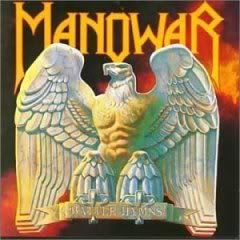
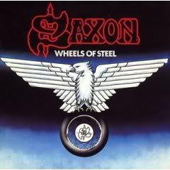
Both look like something drawn by a middle schooler. I'll go with Manowar, because at least it doesn't remind me of nazi insignia.
I'll go with Manowar because of the background colors. Also the Saxon logo looks like an insigna you would see for a gas station in the 1970's.
I prefer Saxon, not only because its the only one of the two I have heard of but it looks "classier" somehow.
Can I say neither?
The top one looks like it was carved out of soap, so I'll go for the Saxon one.
Saxon.
At least the anatomy is less inappropriate (although you'll see birds with oddly primate like bodies on some Budgie covers too).
Bob-I don't think I could draw the Battle Hymns cover when I was in middle school or now.
Pixie-The Manowar cover looks classier than some of their other covers, but I am sure if that is saying much.
Beckeye-Your comment made me think of how my neighbors used to have a submarine carved out of green soap sitting on top of their TV. I thought it was really cool, but it was the 1970's and I was like six.
I like the Manowar cover. It's one of their more tasteful covers. Saxons looks plain and dated
Post a Comment
Subscribe to Post Comments [Atom]
<< Home