Best and worst album covers of 2010
Ah, album covers I still love to look at them. That's not to say they are all good, but I still spend time looking at album covers and it's good to know there are still some fine covers coming out. Let's look at the not so good or bad if you will.
Here are a couple for the could have been better category.

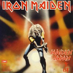
Yeah, it's Eddie, but if a Maiden cover doesn't strike you as being cool right away then something is wrong.

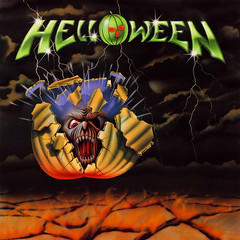
The Helloween logog looks good, but the main image is like a steampunk version of a blender blade. It's okay, but not really front cover worthy.

Davie Rock Feinstein's cover is just totally bland. How much thought really went into this cover?
And...

Lethal Saint's cover is going for a DIY/early thrash cover kind of look, but it comes across as more of a "sketch on a book cover by a bored 8th grader" kind of look.
And finally...

Yngwie in his normal "I am wanker see me pose" stance. There are worse Yngwie covers, but once again this is no good.
Let's look at some of the covers that I really liked.
First some typical ideas done in likable ways.

Yeah, it's a skull and like 30% of all metal albums seem to have them slapped on their covers. I like the cover of Earthride's latest. The backgrounds colors and the blending of the object work for me.

Okay, it's a tough warrior with a weapon and we see plenty of those all over metal covers every year, but I really took to Immaculate's album cover. I only wish the music had been as good as the cover...it wasn't though.
Some different ones...

Intronaut's latest is an odd, but catchy cover.

Dawnbringer's latest uses only a few colors, but I love the depth and the mood they create.
And finally...

The Rocketchief cover plays on a definite nostalgia angle, but I loved it the first time I saw it.
***There you go. Feel free to add what covers from 2010 you liked or didn't like.
Labels: 2010, best, Clash of the album covers, lists, worst albums
posted by Metal Mark at
2:48 AM
4 Comments