Judge the album cover
Here are two covers of the same album. It's Judas Priest's Point of entry so here is....
the U.S. version
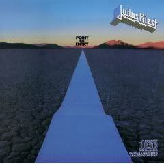
and the UK version
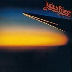
**So do you like them or not and which do you prefer?
***Remember if you like album covers then go check out Whole lotta album covers .
the U.S. version

and the UK version

**So do you like them or not and which do you prefer?
***Remember if you like album covers then go check out Whole lotta album covers .














15 Comments:
I never even knew that there was a different cover in the UK. I always liked the Point of Entry cover in the US even though it was kinda cheesy with the computer paper as a road. The UK cover is pretty cool though too in a minimalist way. I think I'm gonna go with the UK version.
I'm so used to the U.S. version, so I guess that I prefer that one. I don't think that I've seen the U.K. version before. It's good.
The UK version works better for me.
I've never seen the UK cover! Both stink--especially when compared to earlier Priest covers (I've always been partial to Sad Wings of Destiny).
--david
I think both are alright and fairly even. I like the horizon on the US version, but the album title looks very cheap. On the UK version I like the Judas Priest logo as I always thought it looked best in red.
I agree they both are very slipshod vs say Sad Wings of Destiny. If I had to choose one it would probably be the US version as it suits the music better (Heading Out To The Highway, Desert Plains, Solar Angels)
Like most others, I've never seen the UK version before...and I prefer it over the more familiar blue-horizon rendering. The US cover is too much of a departure from other Priest covers...the UK one eases the transition between British Steel's cover and Point of Entry a bit.
I like the UK version better.
Allyson
www.bringbackglam.com
The US version looks like a alst minute F**K up...the UK version is much better. I didn't know that two versions even existed!
Priest were no strangers to having things about their albums changed by this point. Rocka Rolla has two different covers as well and the album we in the U.S. know as "Hell bent for leather" was called "Killing Machine" in the UK.
I don't really care for either of them. But, I would have to say, I like the UK version a little better...
I'm not a big fan of either, both or sort of bland but if I had to choose one I would choose the UK version.
I like the UK version. I always thought the US version was cheesy.
Hmmm... I dunno. Since no one said it, I will say it - the UK one is pretty phallic, which matches the title of the album quite well... I never really liked Judas Priest, so I don't prefer either... just my two cents...LOL.
BTW. I'm linking your blog. Hope you don't mind=:)
I forgot there was a UK version, which actually has more of a cerebral effect, but I do applaud the effect by that old computer paper, so I'll keep with the US version
Post a Comment
Subscribe to Post Comments [Atom]
<< Home