
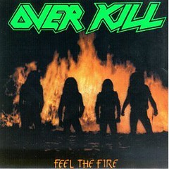
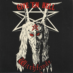
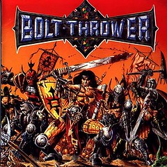
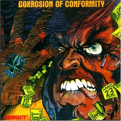
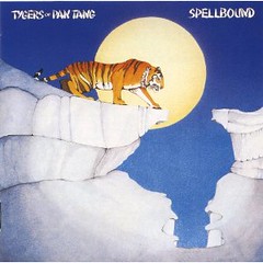
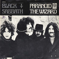
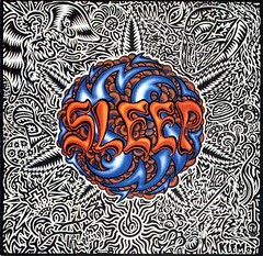
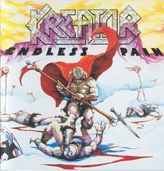
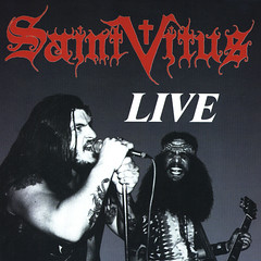
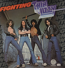
Top band logos
Someone decides the logos of bands. You know how the letters are shaped, colored, the position, shading and all that. We notice that for good or for worse. So which ones do I like?
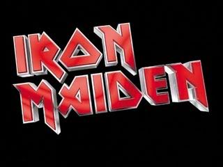
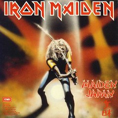
Iron Maiden's letters just draw the eyes in. I love the pointed edges, the angles and the slightly uneven flow. One of the most influential metal logos too and I think it looks best in red.
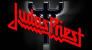
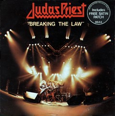
Judas Priest's original logo was good too, but I prefer this. It's got a nice flow to it.
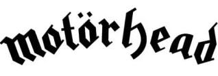
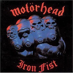
Motorhead's logo may have had some influence on Maiden's and it' also a classic. Looks awesome with their mascot, but can stand alone too.
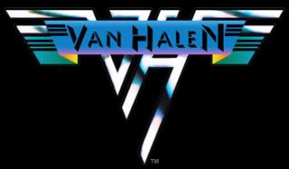
Van Halen's VH logo has been drawn upon many a book cover by kids over the years. It's simple and easily recognizable.
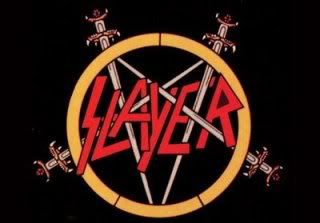
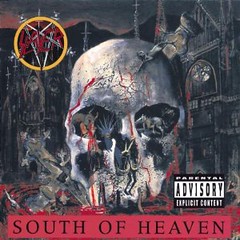
Slayer's old sword pentagram thing takes up a lot of room, but I have always liked it and thought it worked for them.
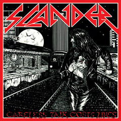
For ones I don't like the main type that comes to mind are death metal logos that you cannot read. Maybe they are ashamed to put their names on the cover. I could understand that in some cases.
What do you like or don't like?

Iron Maiden's letters just draw the eyes in. I love the pointed edges, the angles and the slightly uneven flow. One of the most influential metal logos too and I think it looks best in red.

Judas Priest's original logo was good too, but I prefer this. It's got a nice flow to it.
Motorhead's logo may have had some influence on Maiden's and it' also a classic. Looks awesome with their mascot, but can stand alone too.
Van Halen's VH logo has been drawn upon many a book cover by kids over the years. It's simple and easily recognizable.
Slayer's old sword pentagram thing takes up a lot of room, but I have always liked it and thought it worked for them.
For ones I don't like the main type that comes to mind are death metal logos that you cannot read. Maybe they are ashamed to put their names on the cover. I could understand that in some cases.
What do you like or don't like?
Labels: logos
posted by Metal Mark at
1:25 AM
![]()
![]()


6 Comments:
Maiden's logo is so good that you can easily find free downloadable fonts that people have created. There may be some for other bands as well, but they're not nearly as pervasive.
Here are some that come to mind that I always thought were nice:
Dark Angel (with or without wings)
At War
Rigor Mortis (first album)
Hellwitch
Unleashed
Authorize
Abominog
Sentinel Beast (with the dogs)
Viking
Flames ("Summon The Dead")
Mandator
Target ("Mission Executed")
Stone
E-X-E
Toxik
The DRI dancing guy logo is really bad ass too - specially the chrome one from Crossover. don't know if that logo counts though.
Always loved the Scorpions' "Rollerball" lettering. I think they pretty much made that their own. And I agree with Maiden. Another I liked was the Accept logo from Breaker and Restless and Wild. Oooh, and Raven!
I always thought Lizzy Borden had a great logo.
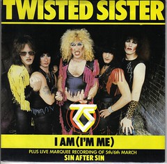
I've always had a fondness for Twisted Sisters logo.
I prefer Priest's Sad Wings era logo.
Post a Comment
Subscribe to Post Comments [Atom]
<< Home