
Judge the album cover
Having skulls on heavy metal album covers has been around about as long as heavy metal. Here are a few skull album covers.
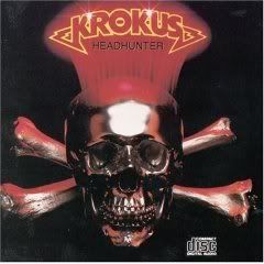
First is Headhunter by Krokus from 1983.
Next if Forbidden Evil by Forbidden from 1988.

Third is Doomsday Machine by Arch Enemy from 2005.

**Do you like any of them, don't like them or are they just alright?
First is Headhunter by Krokus from 1983.
Next if Forbidden Evil by Forbidden from 1988.
Third is Doomsday Machine by Arch Enemy from 2005.
**Do you like any of them, don't like them or are they just alright?
posted by Metal Mark at
12:53 AM
![]()
![]()


11 Comments:
The Krokus one is pretty good.
The Forbidden album cover is really cool! Best of the bunch!
And I don't really care for the Arch Enemy album cover. It just doesn't catch the eye...
I'm pretty fond of the Forbidden cover myself. It's pretty cool.
One of my favorite skull album covers is Devastation's Violent Termination. Unfortunately, the music didn't measure up to the crazy cover. Of the ones you picked, I think I like the Arch Enemy cover best, but the image isn't very big and I'm not familiar with it. My second choice is Headhunter. It has that kinda cheesy low-budget look to it, but I always wanted a skull like that to decorate my house!
The Krokus cover kicks ass. It was actually one of the reasons that I bought it back in the day.
Arch Enemy seems the most ominous which is the effect a skull should do - so I have to go with that one. Krokus just looks like zoomed in badge and the Forbidden is too colorful. You should have put Testament's Legacy in there too cause it was for me the most surreal skull on a albums cover - kinda like the Evil Dead movies.
Krokus and Arch Enemy work for me. I don't know why.
-- david
I like the Forbidden because it reminds me of 1980's comic book art.
While the actual skull on the Forbidden cover isn't bad, the cover as a whole is awful. They've got the cheap-ass logo that mashes together Iron Maiden's lettering with Metallica's design. The album name is randomly printed on the bottom in whatever typeface was available on the Mac SE circa 1988. And most importantly, who the hell decided that pink, blue, and yellow would be the correct color scheme to convey terror and evil? Yeah, when I see these colors, I definitely thinking of clashing skulls before I think of the Easter Bunny.
Arch Enemy: If it were a Tool cover, it would still be generic crap. But it's not a Tool cover, because Tool had the common sense not to put out album covers this lame.
Thus, by default, Krokus is my favorite, even if it does look like a game token from the Metal version of Monopoly. (Metalopoly?)
Chuck-You may be right about the Monopoly comment. For some reason when I see the Forbidden cover and the clashing skulls I think of a heavy metal version of Rock 'em sock 'em robots.
I have to pick the Krokus Headhunter cover. I love that disc.
I like them all. Nothing wrong with some skulls on the cover. Though the Forbidden one is slighty cheesy.
Post a Comment
Subscribe to Post Comments [Atom]
<< Home